TOOKS
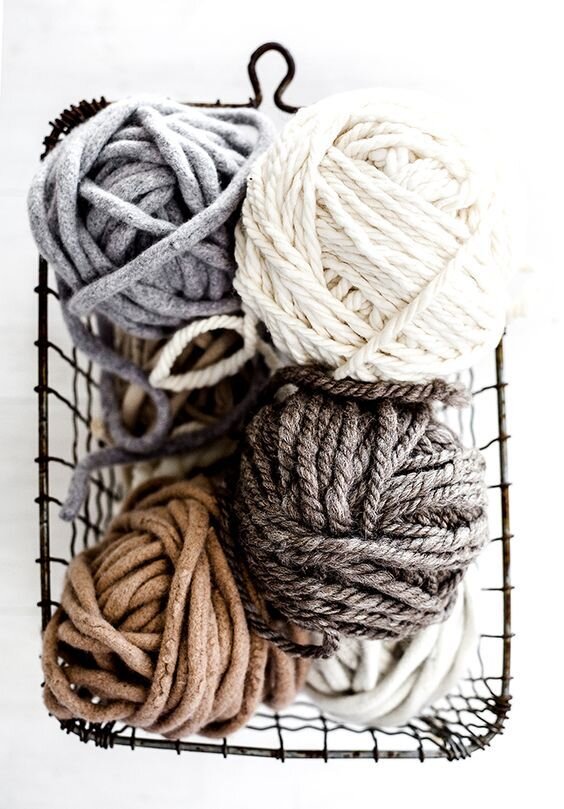
This brand was a side hustle created from a hand-knit ear-flap toque with Scandinavian roots. Key words here were neutral, nordic, outdoor, and winter wonderland.


The Logo
Double letters get attention. For whatever sneaky psychological reason, when brand names are fun to look at or say out loud, they are much more memorable. Think Apple, Lululemon, Goop. This logo was meant to be round and puffy and warm and cool all at the same time — like a nice pillow.
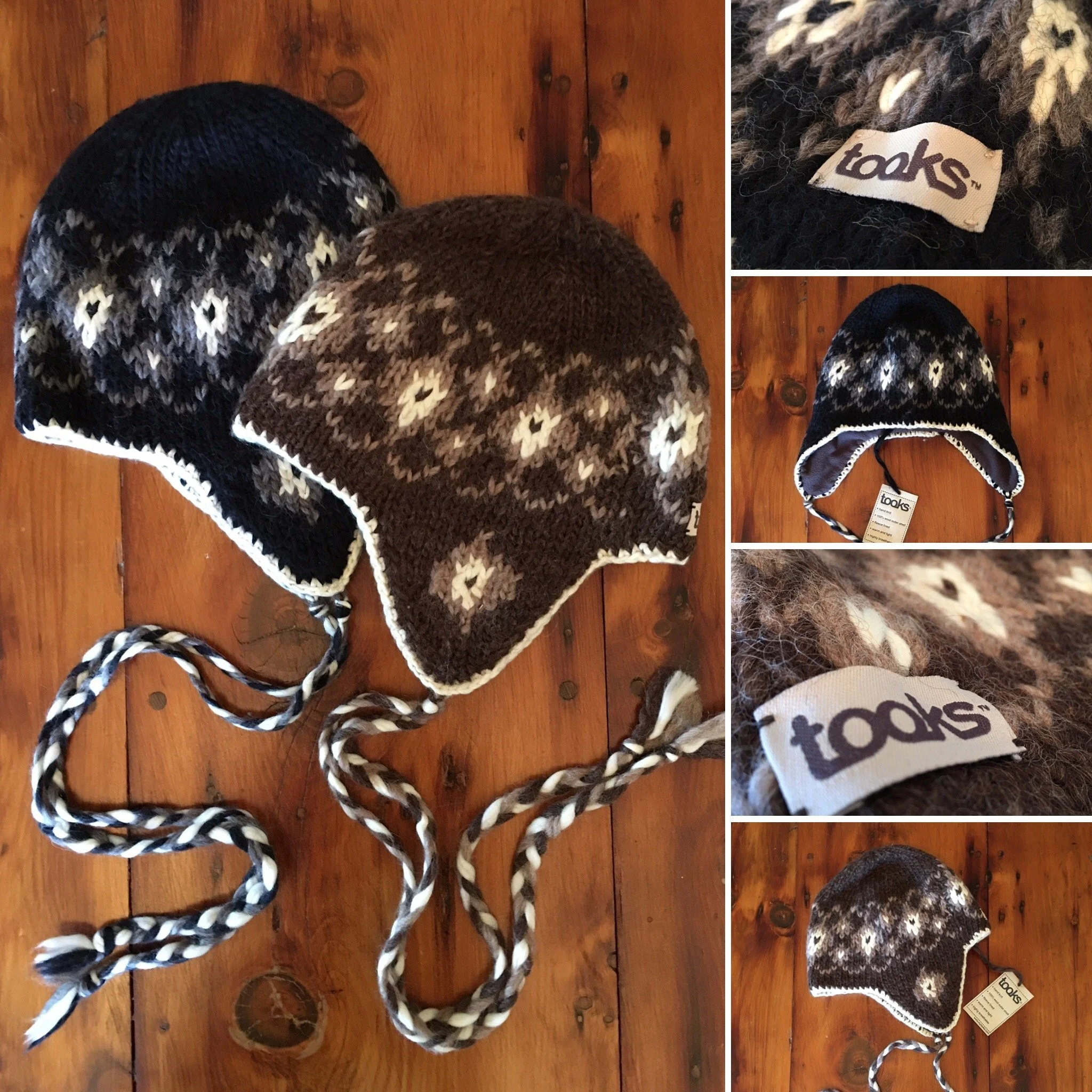

The goods.
100% wool and fully lined this toque has magical properties and gives whoever is wearing it the sun-kissed rosy cheeks of a brisk excursion on a winter day.