For Love & Layers
A party without cake is just a meeting — Julia Childs, maybe. There is no documentation that she actually said this, but who cares? It’s true, nonetheless. This brand results from a cake-making trend called nearly naked and with lots of layers. Keywords here were rustic, scrumptious, dreamy, and heart throbbing to look at, plus you just want to cram a handful into your mouth or someone else’s.


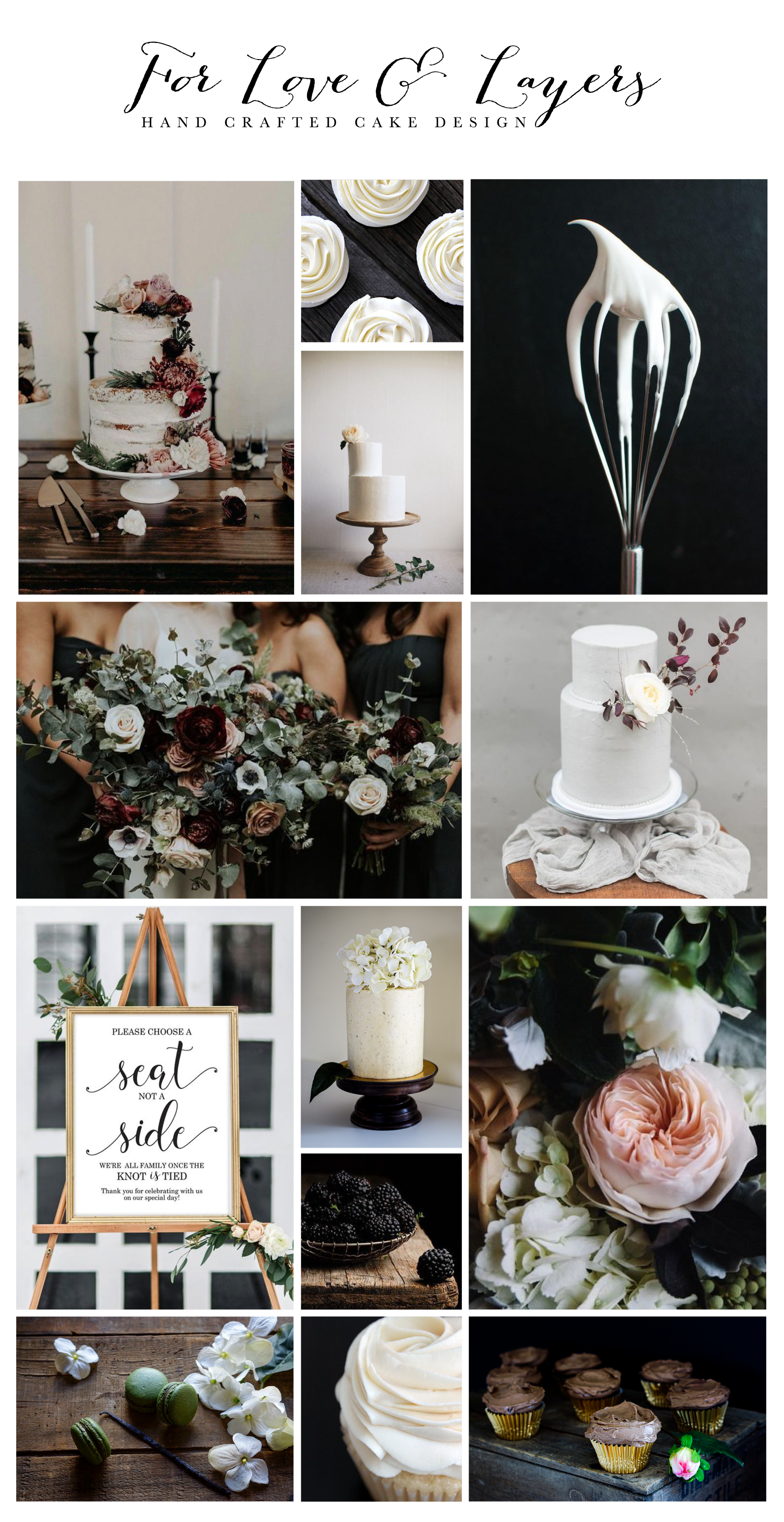
The beginning of the brand.
My process begins with a vision board. I’m inspired by others who do great things and aspire to do the same.
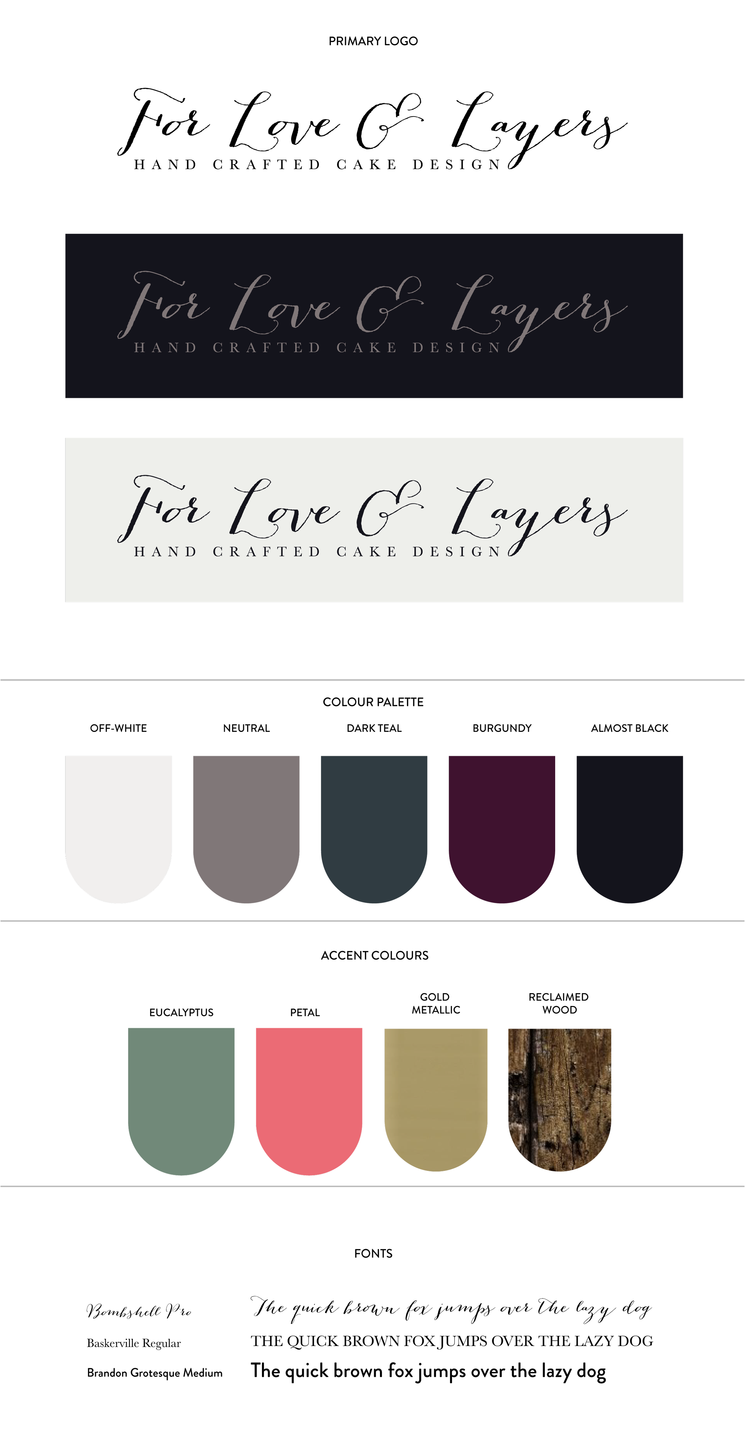
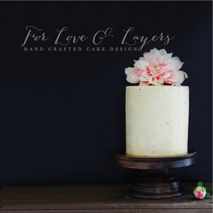
This logo took a complimentary turn with an elegant freehand typeface paired with a more structured uppercase serif font. The end result is a true reflection of the balance between organic and on-purpose imperfections of the cake design.
The Logo
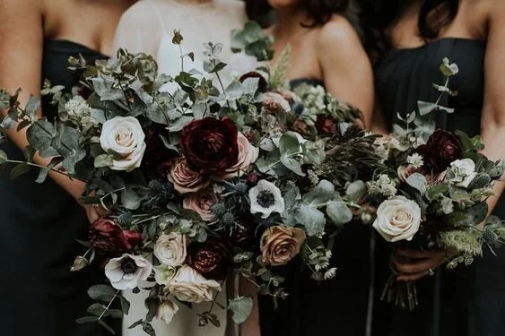
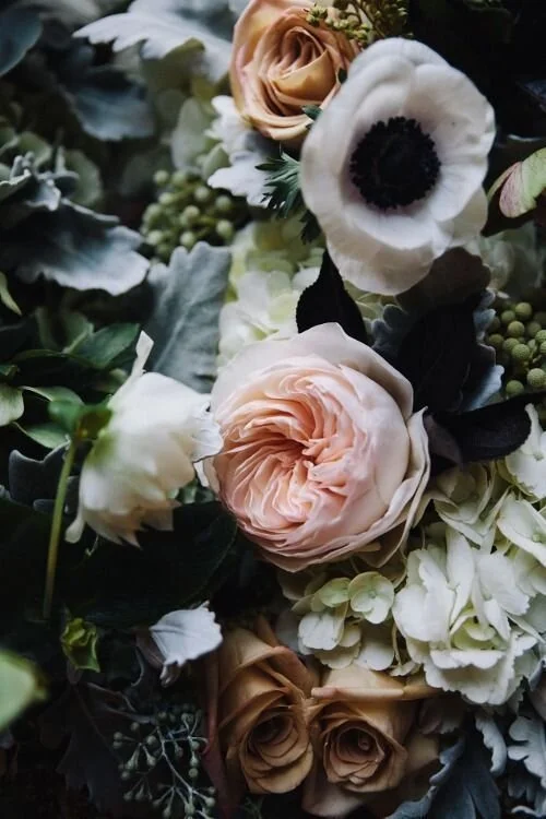
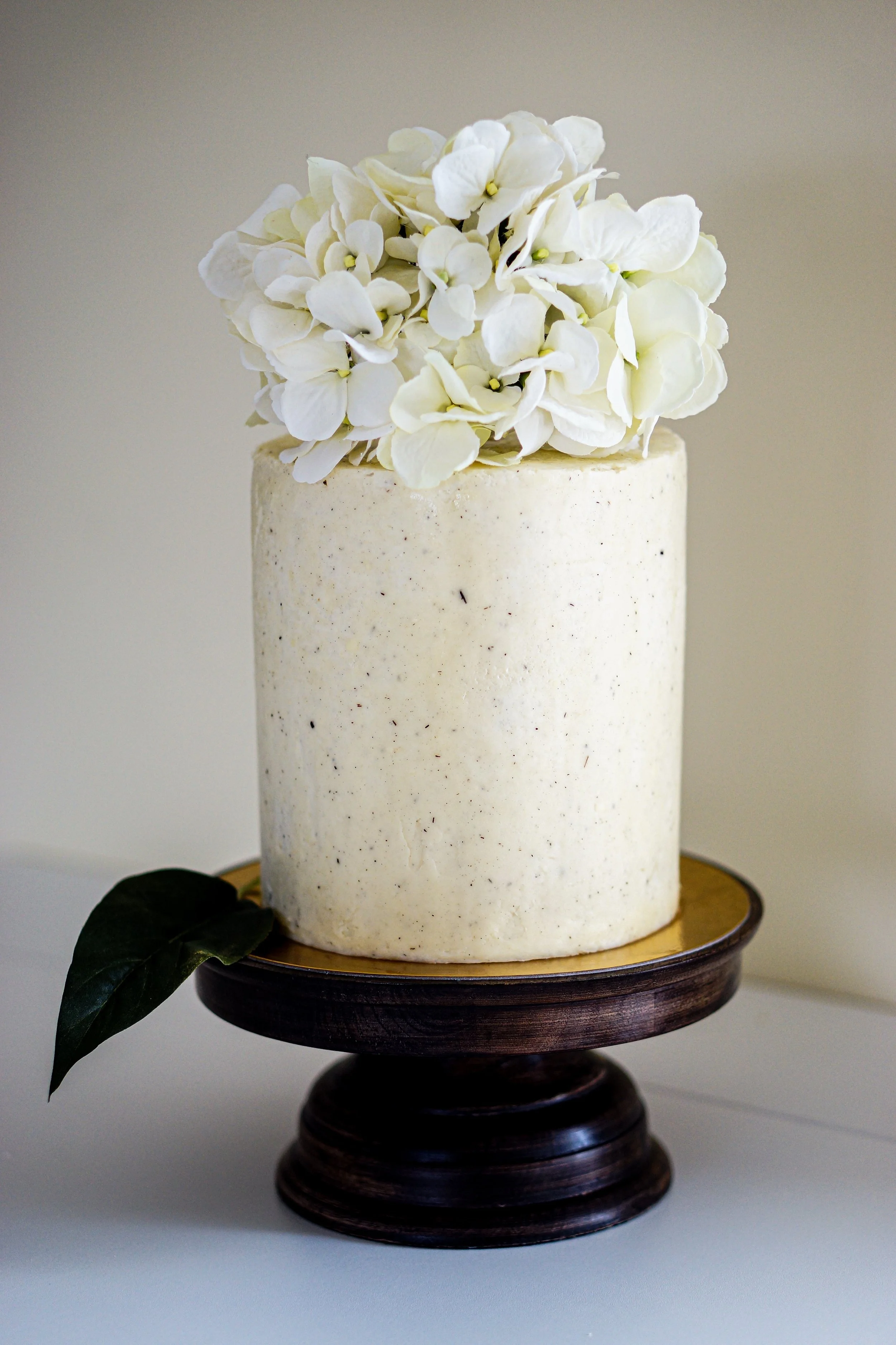
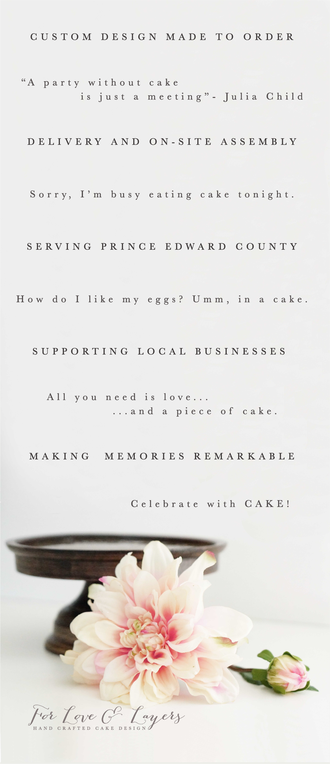
Photography Assets
Once the brand identity is created, it’s easy to style a photoshoot that aligns and guarantees the result is consistent. Consistency is paramount.


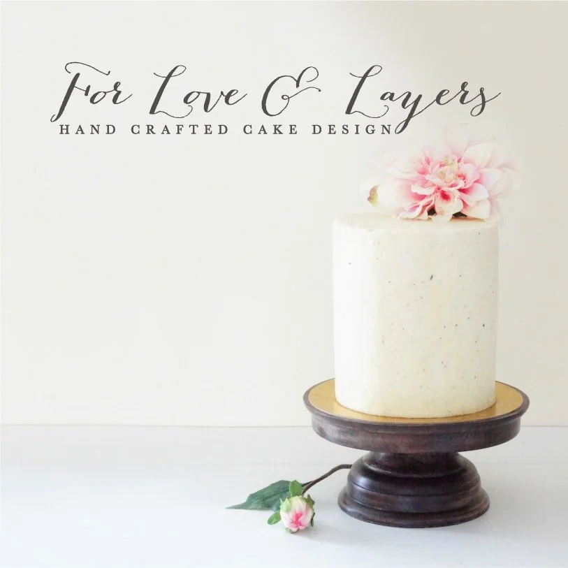


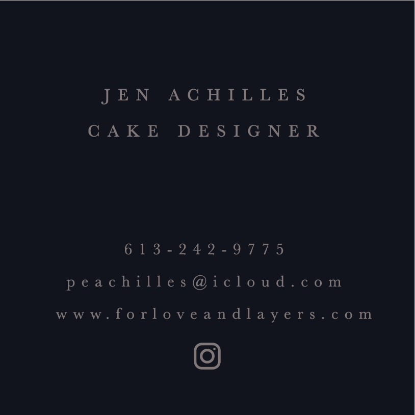
Print Assets
See the consistency come alive from images to assets. It’s all part of making your brand memorable. Repetition does that.